CSCI 2951L – Redesign Assignment
It is very common for a craft brewery to regularly release seasonal, regular and special releases each year. This means that in order for craft beer enthusiasts to keep track of new releases and styles from their favorite breweries they have to spend a lot of time researching what will be released and what is currently available. A trip to a local liquor store is sure to overwhelm most novice beer enthusiasts, since there are many different styles and tons of different options to choose from. The wine industry has this problem as well, however it’s a more difficult problem that is outside the scope of this redesign.
The primary problem I am addressing in this redesign is a problem I and many others have. When I am standing in a liquor store and I see a new beer on a shelf, I ask myself the following common questions (I include example answers from the website RateBeer [2]):
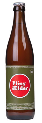
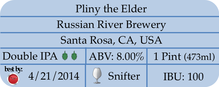
I listed possible answers to these questions above, however finding these answers may not be present on the bottle itself or straight forward. For example, Figure 1 shows the label for the beer I provided answers to, Pliny the Elder.
Figure 1: Example beer label for a popular craft beer. Some information is in the label such as beer name, brewery name, location, etc.
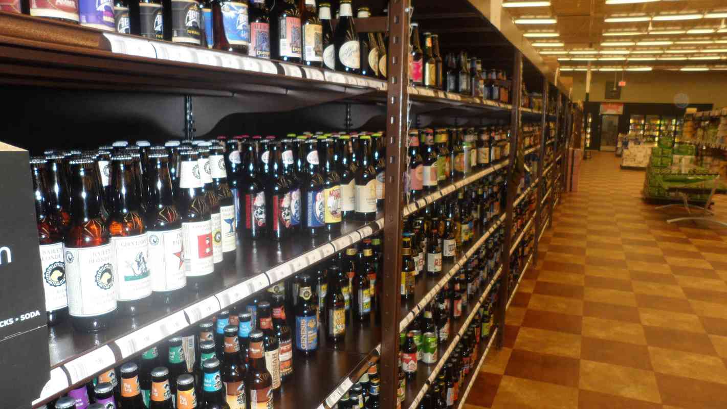
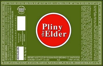
Figure 2: This is an image of the actual beer whose label is shown in Figure 1. This shows the scale and coverage of the label.
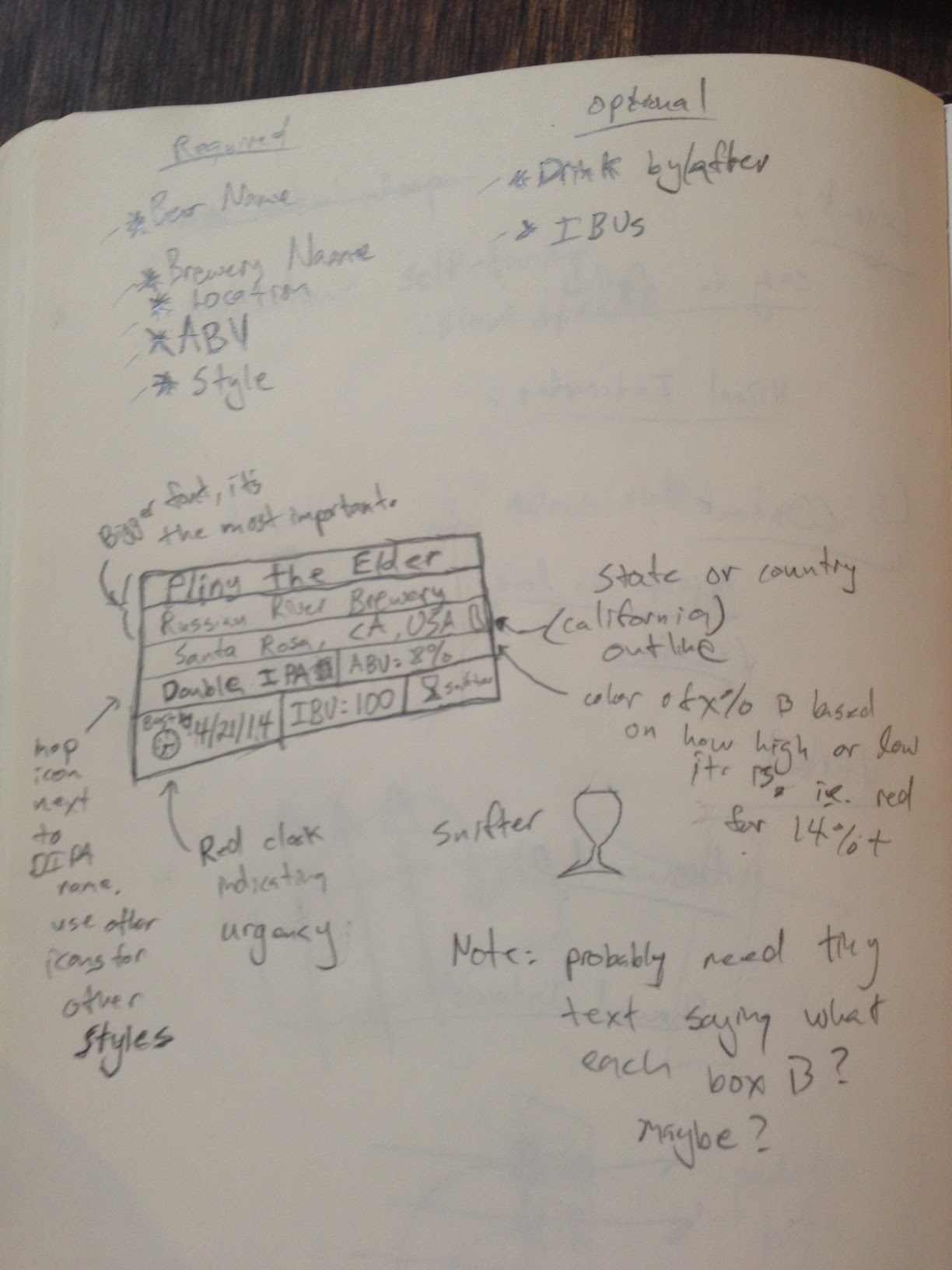
As somewhat seen in Figures 1 and 2, these common questions can be surprisingly hard to answer for certain beers. Some really good liquor stores will make some of this easier by placing their beers on shelves organized by style or maybe brewery location, which can be helpful, but this not always done. What I am trying to provide is a way for a consumer to quickly grab a bottle and find out the answers to almost all their questions about a beer in one common spot and style. This way when you walk into a liquor store that looks like Figure 3, which is common in many cities, you have a hope of finding something you are interested in more quickly instead of trying to search on your smartphone for information about the many unknown beers you are interested in.
Figure 3: A typical bottle shop or liquor store’s collection of beers, notice they are single bottles and not large packs which drastically increases the variety.
The spot I am proposing is on the back of the bottle, this would easily work for 12oz–40oz bottles. It should be noted that I am limiting the scope of this redesign to single bottles and purposely ignoring macro-brew style 24-packs or large quantity packs that you commonly see for beers like budweiser.
In addition to these common questions there are a few more specific questions that commonly arise when trying to better understand a beer:
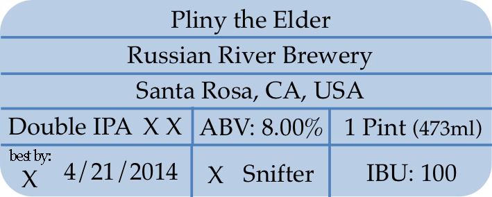
My initial drawing of the label is show in Figure 4. This was a notebook sketch with notes about things that I wanted to include, such as logos, etc. After doing this version I realized that I was missing the container volume metric. I cleaned up the label and re-drew it, which can be seen in Figure 5.
Figure 4: An initial sketch of the label that contains most of the information originally discussed.
Figure 5: A cleaned up version of the label, that includes volume information.
I was fairly satisfied with the label’s structure. in my opinion these boxes are presented in chronological order of importance/significance from top to bottom, left to right. The top 3 boxes are the largest and most important statistics, then style,
Figure 6: This is the first draft of the label done in PowerPoint and Photoshop (I did not have access to Adobe Illustrator sadly).
In Figure 6 you can see a draft version of the label done digitally in PowerPoint and slightly modified in Photoshop. The X’s in the label represent missing icons that would be similar to those in the initial drawings. This initial version measured in at 20mm x 50mm (close to 3/4” x 2”). Based on some of my own measurements, I believe this size should roughly be small enough to fit onto a bottle and large enough to make out the text without having to strain your eyes. Conducting a user study or leveraging prior work in this area would be needed to determine an optimal size, however I leave that to future work.
In terms of adding icons to the label, this is important for the overall presentation of the label. I am not claiming to be a graphic designer at all, so I would defer to someone else to do the actual design. Figure 7 shows the final version of the label.
Figure 7: Final version of the new beer bottle label.
In conclusion, I believe this new label is a clearer presentation and more aligned with the chronological events that go through a beer enthusiasts mind when they see a new bottle of beer on a shelf. This new label does not represent all possible information that a beer enthusiast could want, however I would argue that it presents the majority of the desired information.
[1] http://www.brewersassociation.org/pages/business-tools/craft-brewing-statistics/facts
[2] http://www.ratebeer.com/beer/russian-river-pliny-the-elder/8936/