Quick Information Retrieval
via
Grouping and Symbols
When I moved to Providence, I had to change my out-of-state driver’s license to Rhode Island’s. When I received my driver’s license, the first thing that caught my attention was how different the layout was from my old one. I remember looking at it carefully to see what the expiration date was. That date was the latest I could postpone a visit to DMV after all. It took me a while to find it even though driver’s licenses are designed to have barely enough information on them. You may think that it shouldn’t be that hard to find but if you consider all the background images and patterns, color choices and the layout of a drivers license, it really is hard to find a piece of information on it especially if you’re seeing a new design. I am sure people with out of state driver’s licenses can relate if they have ever been asked to present an ID to prove their age. That awkward silence while the guy at the entrance checks out your ID: to point or not to point. You’d better let him find it. Surely, you get used to the layout in time and forget that you hated it when you first saw it.
Here is an original driver’s license design:
You need to look at it twice to see which part is the name and which part is the address. Physical attributes are scattered all over the card and there are bits of information at every corner. It is like they’ve put the information pieces in a jar, shook it and poured it over this card.
When we talked about the boarding pass example in class, the first thing I thought of was the layout of a driver’s license. The question I had in mind was: Can we redesign driver’s licenses so that an information can be retrieved easily. I thought of using symbols for the pieces of information that are frequently used or can be coded in symbols. I was convinced that grouping information together would further improve the design I had in mind.
I think, date of birth is the most frequently referred part of a driver’s license. I have never been stopped by the police so the only time someone else has looked at my license is when entering a bar or purchasing alcohol. Because of this, the first idea I had was to have a plus twenty one sign at the right hand corner of a driver’s license.
Physical attributes of the id owner is almost always the smallest information on a driver’s license. I wanted to represent them with symbols in order to get rid of any kind of extra writings on the card. If I could easily represent them with symbols, the whole design would look cleaner.
I later realized that hair color is not mentioned on driver’s licenses. I think it makes sense because it’s the most frequently changed attribute. I removed this from my design in the later iterations so you can ignore it.
At this point I took a break from converting information to symbols and started thinking about how I can group information. I came up with multiple ways to group information. There are 2 most obvious ways in my opinion. I could either: group it according to who might be viewing the driver’s license, or categorize the related information together. Some designs I previously considered included separating the core personal info from others: name, address, physical attributes, date of birth; or separating the symbols from others: physical attributes and +21 sign; or separating most frequently used information from others: name, license number, date of birth. After trying these ideas on several design iterations, I have decided to go with information similarity approach considering that this would make more sense to improve timing of information retrieval.
The following image is the first design iteration I created after I decided on a grouping strategy:
I was not very satisfied with this design because even though related information was grouped together, it still didn’t feel like it would take someone less time to extract information out of it. I felt like I needed to group similar types of information together.
In the following design, I tried to divide the card into 4 sections. The leftmost section has the physical attributes of the owner along with their picture for reference. The second section is mostly composed of text except the numbers in the address field. The third section only has fields with numbers and the rightmost section has the remaining information that I thought I could represent with symbols in prospective designs.
By grouping similar types of information together, I wanted to make use of human pattern recognition. If the viewer is looking for a date or a number (license number, issue date, expiration date, date of birth) I would assume the eye would look for numbers on a card. More specifically it may look for a date format while looking for issue date, expiration date or date of birth. In this case the eye may focus on the third section. If the viewer is looking for an information such as name, address or signature, it may look for text or text like writings on the card. In this case, eye may focus on the second section. For physical attributes, it may focus on the picture which is in the leftmost section along with some physical information. Obviously, the effect of grouping information on human pattern recognition should be tested in detail. These are my assumptions and testing and research might as well disprove these assumptions. It would be interesting to see the results of such experiment.
At this point I was satisfied with the strategy I used for grouping information so I decided to go back to exploring the possibility of using symbols where applicable. Using symbols are generally tricky because the perception of signs and symbols changes geographically and depends on culture and environment. I tried to use universal symbols for the fields I have decided to represent.
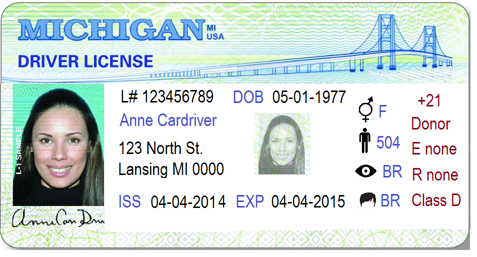
Here is my final design. Let’s assume Anne Cardriver is a motorcyclist and she needs to use glasses or corrective lenses while driving. She is an organ donor and she is older than 21:
My final design probably needs some improvements considering that some of the ideas I have may not be applicable on official documents such as a driver’s license for authenticity purposes. I suspect some of the endorsements or restrictions may not be representable by symbols. To answer these questions, further research should be done. To determine the usability of this design, a specific experiment should be designed to see if grouping information together or representing information with symbols improves the readability of information on a driver’s license.