Setup
Accept the Github Classroom assignment and clone this repo that contains stencil code for Assignment 1.
Introduction
This is a multi-part assignment with the objective of making you comfortable working with HTML and CSS. By the end of this assignment, you will have styled some rectangular blocks and created a simple version of Twitter's home page.
If this assignment seems overwhelming to you, please come see a TA at TA hours to talk through some strategies for tackling it. We expect this assignment to be a time-consuming assignment as we cover a lot of fundamental techiniques. But with a good strategy, it can be finished in a reasonable amount of time.
Note: Only CSS and HTML will be used for this assignment. If you want to use JavaScript (or libraries such as jQuery) then feel free to, but we will only be grading correctness on your CSS and HTML.
If you can, Start Early!
Part One
Specifications
Now that you understand some of the basics of HTML and CSS, let’s take a look at how to align HTML elements. There are multiple ways to align HTML elements, but in this part, we recommend using flexboxes as they are widely used in modern web development (for example BootstrapV4 is built on top of flexboxes).
Refer to this great webpage on how to use flexboxes: CSS Flexbox Guide .
Also feel free to use online resources such as Stack Overflow, MDN, W3, and Google for reference.
When you open the provided HTML file
part1/index.html
, it should look like this:

As you can see, there are 9 rectangles. The styling and makeup of the first two rectangles are already built for you. Your task is to apply stylings and add div elements inside of the next 7 green rectangular blocks to create a webpage that looks like this:
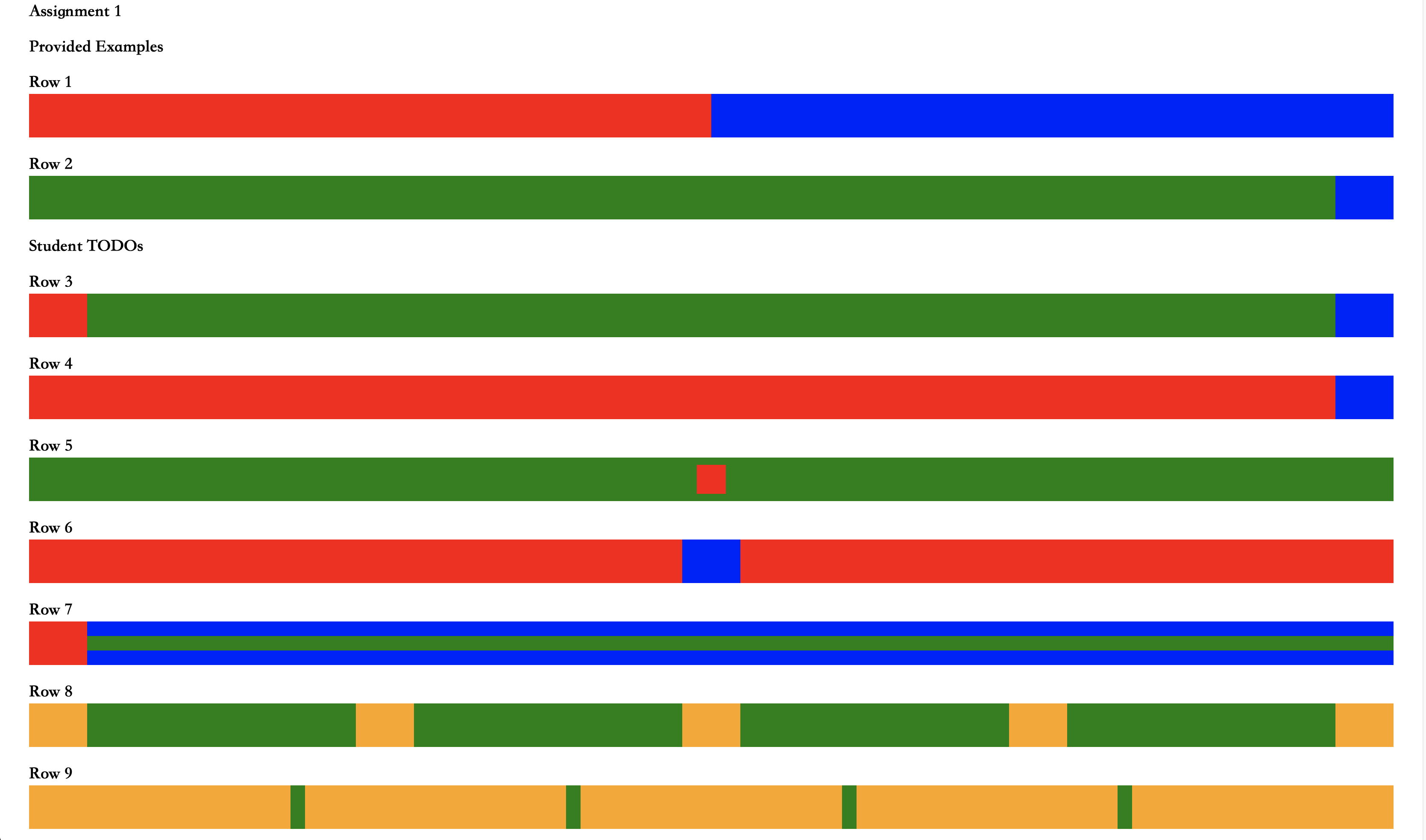
Note that these rectangular blocks should be responsive. Here is what they look like when the window is thinner:

We will describe how each row will behave dynamically and provide some hints for a possible approach:
-
For the third row, the red and blue end rectangles should remain the same width, and the green space should shrink.
Possible Approach: Have a div with a red background and a div with a blue background, both with fixed width. Use an appropriate value for Justify Content.
-
For the fourth row, the blue end rectangle should remain the same width, and the red rectangle should shrink.
Possible Approach: Have a div with a red background and a div with a blue background. Have a fixed width on the blue div. Use Flex Grow.
-
For the fifth row, the red square should remain the same size, but always remain in the center of the green rectangle.
Hint: Think about how to keep a div fixed size and how to align something in the absolute center of the parent element.
-
For the sixth row, the blue rectangle should remain the same size, while the red rectangles should shrink. The blue rectangle should remain in the center of the row.
Hint: Use two red divs.
-
For the seventh row, the red rectangle should remain the same width.
Hint: Nest divs and use
background-color: transparent -
For the eighth row, the orange rectangles should remain the same size while the green space between them shrinks.
-
For the ninth row, the green space between the orange rectangles should remain the same width while the orange rectangles narrow.
The examples we provided with the first two rectangular blocks use flexboxes. You are not required to use flexboxes for the next 7 rows, but we recommend it as it will also be useful in part 2 of this assignment.
You should only have to use the
div
html element to complete this assignment. Also, none of the divs you create inside of the provided wrapper divs should have
background-color: green;
. But it is valid to specify non-green background colors for any divs, including the wrapper.
Try to style the boxes as closely to the solution image as possible don't worry about getting exact dimensions or rgb values. We care about what structure, CSS styles you used, and the dynamic behavior of the page. However just for reference,
-
The color of the boxes we used are
background-color:red,blue, andorange -
Some width/height values we used are
20px, 40px, 80px
You are not required to use Bootstrap in this part. You can use if you want, but we actually recommend writing plain CSS. Just for this part, inline CSS is acceptable, but you should generally avoid using inline CSS in the future.
Part Two
Setup
Any images you'll need can be found in the
part2/images
folder, which can be referenced as
./images
(when CSS is in its own file, URLs are relative to the CSS file, not the page it is loaded on). All of your HTML should go in the
index.html
file and all of your CSS should go in the
index.css
file.
Specifications
For this assignment, we want you to use HTML and CSS to create a static web page based off of
Twitter
as below. We chose to use Twitter because later in the course you will be dynamically fetching tweets from a server, so we figured it would be fitting to create the user interface for it beforehand:

Similarly to Part 1, this site should also be responsive. When the browser window is thin enough, the ‘Who to follow’ section should disappear.

Feel free to go on Twitter and use your browser’s inspect element to see how they do font sizes, font weights, margins, paddings, text colors, and background colors (use inspector). Our solution is a bit different than Twitter’s architecture because twitter’s HTML/CSS setup is way too complicated for a simple web mockup. If you try to copy Twitter’s code instead of creating the HTML elements yourself, you’ll end up spending way more time trying to figure out what each div does and how to decipher their massive styling code base.
Ethics Requirements
In addition to the functionality requirements listed below, we want you to make your interface screen reader friendly, so that more users can enjoy your Twitter! Here’s what we’re asking you to do and why:
-
A screen reader needs to know in advance what language your website is in in order to function properly.
To help it out, make sure to declare the language of your website in the lang= attribute of the
htmltag. -
Blind and low-sighted users often can’t see images on a site.
-
To help them enjoy your site’s content, all images must have
alttext. -
The
alttext goes in thealt="..."attribute of the image element. -
You should give a basic description of what is in the image. Putting
image
in thealtattribute does not count!
-
To help them enjoy your site’s content, all images must have
-
Blind or low-sighted users may want to “skim through” a page using their screen reader. To make that easier, the page should have a logical hierarchy using different headings to designate different levels of importance.
Note: your Twitter page won’t have that many headings. Just don’t use headings to style things!
If you want a piece of text that isn’t a heading to be big or bold, use HTML elements like
emandbtag or CSS to style it rather than the heading attribute. -
For people using screen readers to navigate the page, ARIA landmarks are a big help – they can help users skim the page, or to quickly find the content they need. These are attributes that can be added to any element on the page and appear as
role=
attributes within a div’s opening tag. The ARIA landmarks you are required to include are:-
role=navigation(to designate the navigation menu): add this to the navigation bar. -
role=main(main page content, i.e. the tweets): add this to the div you use to contain your tweets.
Look here for more tips and examples.
-
-
Finally, your page should have a skip link (think
<a>!) somewhere at the top of the navigation. Skip links are links at the top of the page which allow a user to skip to the main content of the page. They’re important for older browsers and screen readers that may not support ARIA landmark navigation.-
This can be styled any way you like! However, for this project, hide them using
display: none;. -
To do this, you’ll have to give the div you will be jumping to an ID, and have the link
href="..."attribute point to that div’s ID. For example, if I wanted to jump to a div with the ID myDiv, I would have the following link:<a href=”#myDiv”>Jump to myDiv</a> -
In our case, this means skipping to
content-wrapper
orcontent-center
, depending on your implementation. More tips and examples can be found here.
-
This can be styled any way you like! However, for this project, hide them using
We recommend running your page through WAVE’s accessibility checker, which we asked you to add to your Firefox and/or Chrome browsers during lab 1. We’ll be using that tool to test whether your ARIA landmarks and general hierarchy are logical, as well as whether you’ve implemented alt text in your image descriptions.
Note: The Chrome WAVE extension has been a little finicky lately. If you’re having trouble, try running your code on a department machine and/or using Firefox.
For help, take a look at our Accessibility Resource Sheet in Docs or come to TA hours!
Functionality Requirements
In the following, we put together some hints on how to accomplish the functionality requirements. We also encourage you to refer to online resources like MDN and CSSTricks for HTML and CSS properties.
Note: Don't worry about getting the font sizes or font colors exact. That being said, #4AB3F4 is the blue color used in the mockup and #E6ECF0 is the light gray background color.
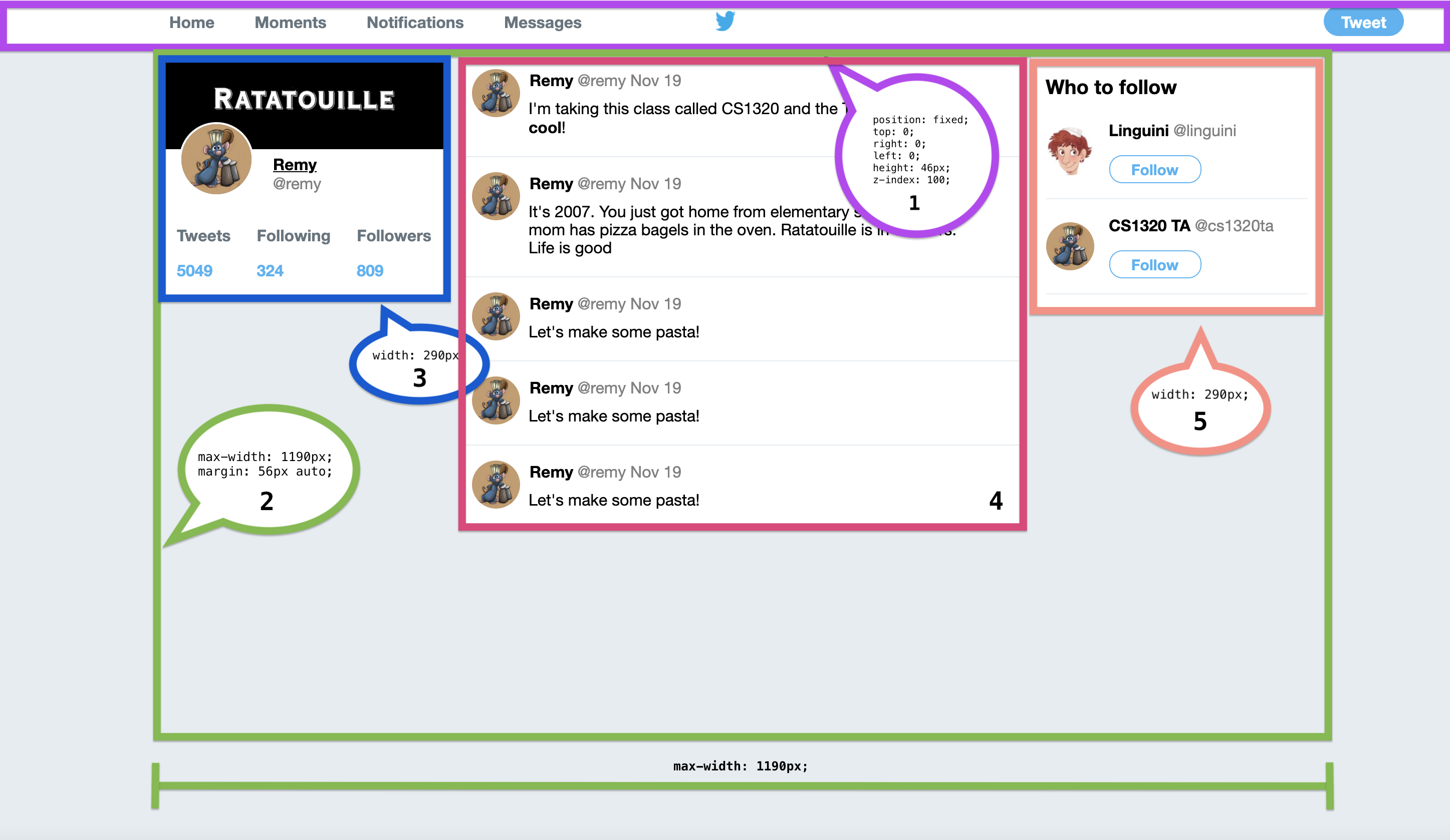
This web page contains five parts:
-
header
Twitter's header is fixed which means when you scroll down, the header remains at the top of the webpage. We will require you to implement your header in a similar manner. To do this, use:
-
position: fixed;Adding this to an element makes it stick to whatever position you specify -
top: 0; left: 0;These are the positions for the fixed element that will keep the element fixed at the top -
z-index: 100;Adding this to an element makes it positioned above other elements (You could probably make it work with z-index: 5, but we put 100 just to make sure). Elements without a specified z-index have a default z-index of 0. Elements with higher z-indexes are placed over elements with lower z-indexes.
If you decide to use Bootstrap, you may find Navbar Placement to be useful.
We will also require you to style the navigation buttons so that they change font color and become underlined when you hover over them. Like this:

You can use.yourCssClass:hover {...}to specify the style on hover. Note:hoveris appended to the CSS selector, in fact, hover is one of the pseudo-class, targeting particular elements at certain state.Lastly, we require you to have the Twitter logo stay in the middle of the header when you resize the window.
If you have trouble making the Twitter logo stay in the middle, you can turn your nav links into icons at smaller screen sizes.
Here are a set of FontAwesome icons for you to use, after including the FontAwesome script
<script src="https://cdnjs.cloudflare.com/ajax/libs/font-awesome/5.11.2/js/all.min.js" integrity="sha256-qM7QTJSlvtPSxVRjVWNM2OfTAz/3k5ovHOKmKXuYMO4=" crossorigin="anonymous"></script>-
Home
<i class="fas fa-home"></i> -
Moments
<i class="fas fa-hashtag"></i> -
Notifications
<i class="far fa-bell"></i> -
Messages
<i class="far fa-envelope"></i>
The file path of the twitter logo is
./images/twitter-logo.png -
-
content-wrapper
We require you to have all the content below the header within a boundary that is centered on the screen. To do this, we recommend creating a wrapper div for the three columns below the header. Use these styles on the wrapper div:
-
max-width: 1190px;This sets the maximum width of the element. -
margin: 56px auto;This sets the vertical margins to 56px so that it is below the header and the horizontal margins to automatically center the element.
-
-
content-left
In our solution, content-left is made up of 3 rows (divs):

- Cover picture (purple)
- Profile picture (orange)
- Profile stats (green)
We require you to create the overlapping effect between the profile picture and cover picture. Usually to sepcify priority in stacked display (think it as layers), you will use
z-index.There are multiple ways to create overlapping effect, absolute positioning the cover picture is one way to do it. After configuring the
z-indexproperly. You can use:-
position: absolute;With this you can specify the exact coordinates of an element. This is different thanposition: fixed;in that an absolutely positioned element will not stick to its position on the screen when you scroll. -
The filepath of the cover picture is
./images/ratatouille-banner.pngwhile./images/ratatouille.jpgis the filepath of the profile picture for Remy and./images/linguini.pngis the filepath of Linguini's profile picture.
-
content-center

We require that you include the profile picture in every one of the tweets. Additionally, in at least one of the tweets you should have a span tag to change the styling of a single word within the tweet.
border-radius: 50%;or Bootstrap classrounded-circlemakes an element a circle. -
content-right
If you minimize the width of your browser when on Twitter, you will notice that the content on the right disappears at a certain point. This is done using CSS media queries.
We require you to do the same on your mockup. So, use a media query to make content-right disappear when the window’s width is less than or equal to 1200px.
Other than the explicitly stated requirements for this part, we would like you to make your Twitter mockup generally resemble the solution provided above
If you can, please make your webpage compliant across browsers. But we will be testing your assignment on Chrome.
To access Chrome in CIT machine: From the command-line, type
chrome
.
General Notes
As a reminder, it's a good idea to run your HTML and CSS syntax through validators. You should also consider using an accessibility checker such as WAVE.
Troubleshooting
There are hundreds of HTML and CSS tags, properties, and values, and CS132 does not expect students to learn each one by heart. However, this assignment and the first lab are intended for you to intuitively understand the languages, and to be proficient at knowing how to tackle a design by the end of the semester.
If you’re having problems, there are many guides on HTML and CSS online (CSSTricks and MDN are your friends), as well as on our resources page.
As always, if you are stuck on a particular part, you can always talk to the friendly TAs or ask questions on course piazza (check your email for a signup link).
As a general rule of thumb, do not expect TAs to be able to solve every web problem you have. Even the most adept web developer can struggle a lot with specific CSS rules to use.
Hand in
To hand in your code for Assignment 1, upload the directory containing your solution to part 1 and part 2 to Gradescope.