The Data
2D fluid flow past a
cylinder
You can think of it as a river
flowing around a bridge pier with a circular
cross section. The data is calculated
using computational fluid dynamics (CFD) simulations, much the same way
the artery or bat flow cases are.
Because this data is 2D, it is a simplified version of the data
that we
use in the Cave bat visualization.
The lessons we learn in this exercise will apply directly to
visualizing
flow quantities on bat wings.
Because this is where the flow interacts with the bat, the
data is some of the most important, scientifically. It is easier to
work with
2D data like this rather than the full 3D dataset because we have
essentially a 2D
visualization problem. This handout shows a
number of different quantities, all of them over the same space. If they were on acetate, you could overlay
all of them to see how the different values relate.
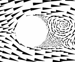
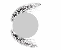
Velocity – speed and
direction. Speed is arrow size.
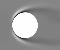
Turbulent
charge. Gray is zero.
Analogous to electric charge
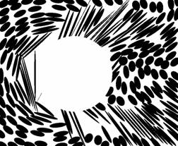
Rate-of-strain
tensor. How particles squish.
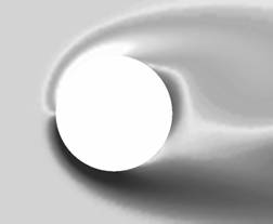
Vorticity
– how particles spin. Gray is no spin,
lighter is clockwise, darker is counterclockwise.
Turbulent
current. Has a magnitude and
direction. Analogous
to electric current.
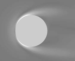
Amount
of
squishing. Eccentricity
of the ellipses to the left. Gray
is no squishing.
[The rest of this document is notes from an earlier
class --
feel free to peruse and use any ideas that sound appealing.]
Now What?
NPR
for Scientific Visualization
SIGGRAPH
’01, Monday Aug. 13
Just try something! The
more you
experiment the more you will learn. If
you get stuck, switch to something else.
Take notes. Jot
down what you
want to try. Jot down any surprises.
Share what you are doing and thinking with
your neighbors.
Which media are good for representing which
data values? Experiment with representing
one or two data
images at a time. Try painting. Use palettes to mix colors and to thin the
paint. Apply it with brushes, a knife,
or your fingers. Scrape it off or smear
it around with a paper towel or finger.
Also try the markers, pastels, and crayons.
Use the different paper types.
What visual representations work for scalars?
Vectors?
Tensors? Try
washes, icons, curves, texture.
How many quantities can you represent in one
visualization? Experiment with
layering visual representations. Mix
media.
What are some tradeoffs in showing multiple
values? Consider, for different data
values:
Small icons vs. large
icons,
A continuous
representation, like a wash, vs. a discrete representation, like icons
High contrast vs. low
contrast,
Different hues or lightnesses,
What visual abstractions for the data are
particularly efficient (i.e.,
use little space on the paper to show much information)?
Clean your brushes
from time to time.
Start with lighter
colors and work towards darker ones.
Try the same idea
out more than once...it may look very different the second time.
Try the same idea
out using a different medium...if you used marker the first time, use
paint the
second time.
Think about the design process you are doing
here. Can you make the concept clearer? Can you identify some new things to try when
you get back to the real world?