Introduction to Color Design
CS137 Assignment #4
|
Out |
Tues, 10/5 |
|
Due |
Thurs, 10/7 |
Gain a conceptual understanding of the characteristics of color and its use in graphic presentation.
Learn to experiment effectively with color, gaining control over its visual effects.
Apply color effectively to a data visualization project.
Gain experience with color effects in relationship to the Cave application.
· Tufte, Edward, Envisioning Information, Chapter 3, Color and Information
· Read either Zwimfter for computer color or Hornung for mixed color:
Zwimfter, Moritz, Color Light Sight Sense, plates 315-470
Hornung, David, Handmade Light, Part Two: First Principle
This assignment should be completed in groups. For this assignment the groups will be:
Group1: Claudia, Ming-Ming,
Joseph
Group2: Helen, Edwin
Group3: Jane, Alex
Group4:
Julie, Sascha
Group5: Janet, Misha
Group6: Laura, Gabe
The goal of this exercise is to experiment with vividness or color in a pure hue range. All colors used should be full saturation hues. They will vary in value according to their basic nature (yellow-high; red-medium; blue-low) and this may or may not affect the brilliance of their visual effect. There are a number of ways to interpret or perceive vividness or brilliance. This is up to you.
Begin by opening a Photoshop file, at 72dpi resolution, about 4 inches high and 2 1/2 inches wide. Using the color picker (double-click on the foreground square at the bottom of the tools palette), choose a foreground color that is a candidate for brightest possible color available (don’t sweat this too much, but pick a good bright color). On the large rectangular field of the color picker window, the little circle should be all the way to the right, indicating full saturation. Fill the rectangle with this color using the paint bucket tool. From the file menu, pull down to Save a Copy. Save a copy in tif format to a new folder.
 Make
a new layer in the layers palette. The layer should be automatically
selected. (If the Layers palette is not visible, pull down “Window”
to “Show Layers”.) Now make a rectangular selection with
the Marquee tool that makes a stripe down the center of the
rectangle. Open the color picker and move the vertical slider up and
down until you find a new color that seems even more vivid than the
first one. You can compare them side-by-side in the little square
window to the upper right of the slider. This will be difficult,
because you were supposed to have already used the brightest color
for your first choice, but you may be surprised at how other colors
assert themselves. The goal is to have your new color be more
assertive when in direct comparison with the first. When you have a
new color that seems to overshadow the first (or is close), click OK
on the Color Picker and use the paint bucket tool to fill the
selected area of the new layer with that color. Now, from the
“Select” Menu at the top of the screen, pull down to
“Inverse” and hit delete. Your new layer is now part
transparent, down “Select” to “Deselect”.
From the File menu, pull down to Save a Copy. Rename the copy (e.g.
tif 2) and save a copy in tif format to your folder.
Make
a new layer in the layers palette. The layer should be automatically
selected. (If the Layers palette is not visible, pull down “Window”
to “Show Layers”.) Now make a rectangular selection with
the Marquee tool that makes a stripe down the center of the
rectangle. Open the color picker and move the vertical slider up and
down until you find a new color that seems even more vivid than the
first one. You can compare them side-by-side in the little square
window to the upper right of the slider. This will be difficult,
because you were supposed to have already used the brightest color
for your first choice, but you may be surprised at how other colors
assert themselves. The goal is to have your new color be more
assertive when in direct comparison with the first. When you have a
new color that seems to overshadow the first (or is close), click OK
on the Color Picker and use the paint bucket tool to fill the
selected area of the new layer with that color. Now, from the
“Select” Menu at the top of the screen, pull down to
“Inverse” and hit delete. Your new layer is now part
transparent, down “Select” to “Deselect”.
From the File menu, pull down to Save a Copy. Rename the copy (e.g.
tif 2) and save a copy in tif format to your folder.
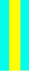
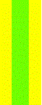
Now select the background layer in the layers palette and and change it to the color of the stripe, then select the stripe layer and experiment with the color picker, staying in the full saturation range until you find a new color which reads more strongly than the background (which is the former stripe color form tif2). Again, this may seem impossible, since your second color was even more brilliant than the first which was supposed to be the most brilliant in the first place, but do your best. Colors react in various ways, and it may be possible to use a new aspect of color to make a strong distinction. If you like, you can use an alternate method for color alteration. Pull down “Image” to “Adjust” and then “Hue/Saturation”. Move the Hue slider in the popup window, and you can adjust the hue in your actual image rather than the small window of the color picker. When you have a stronger color effect, click OK. Save a new, renamed tif copy (tif3).
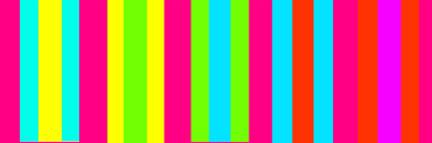
Repeat this step now for the second layer, and then again for the background, and then again for the 2nd layer, always trying to outdo the previous color choice. In the end you should have 5 two-color panels saved as tiffs, plus the original one color panel. Line them up in sequence and gauge the effect. Make a new file at 72 dpi, 5 in high and 20 long, with a black background. Copy and paste each of your panels in sequentially, arrange them left to right with a small separating border around each. Merge the layers, except the black background, by linking them in the layers palette and pulling down in the layers menu to “Merge Linked”. Save the image as “Stripe Composition” in Photoshop.
Part Two: Chromatic Variation
Add another layer to your file, setting it on top of the stripes layer and the background. You should now have three separate layers in the image. Change the background color by selecting the layer in the palette and filling it with a color using the paint bucket tool and the color picker. Find a color which sets off the colors in the stripe layer in an interesting way, contrasting with some colors and merging with others. Keep a fairly high level of saturation in this background color.
 Next,
select the top layer, which should be clear at this point. In the
layers palette, reduce its opacity to about 40%. Then fill it with a
new color, again a fairly high saturation color. Experiment with the
level of opacity in this layer (between 20 and 50 %) and with
different hues, and different background colors. When you have a
pleasing harmony or interesting atmospheric effect, Save a Copy as a
tif, giving it a new name. Make four chromatic variations in this
way. You can also experiment with black or white “veils”
and background tones.
Next,
select the top layer, which should be clear at this point. In the
layers palette, reduce its opacity to about 40%. Then fill it with a
new color, again a fairly high saturation color. Experiment with the
level of opacity in this layer (between 20 and 50 %) and with
different hues, and different background colors. When you have a
pleasing harmony or interesting atmospheric effect, Save a Copy as a
tif, giving it a new name. Make four chromatic variations in this
way. You can also experiment with black or white “veils”
and background tones.
Part Three: Figure and Ground Composition.
Now use one of your more atmospherically unified chromatic tifs as a background, and cut and paste selections from another, different Tif onto it as “figures”. You can stick with straight rectangular shapes, or make organic forms or threads using the lasso tool and filling the selection with the Paintbucket. Each of your new shapes should be a separate layer, so that you can experiment with color adjustment in relation to the background and move the forms around two dimensionally. Try to make a composition which suggest movement around the page, but also in and out of “space”, by altering the level of contrast between the floating elements and the background tones. Stronger contrast between figure and ground will bring the figure forward, lesser contrast will push it back in space. The easiest format for these manipulations is probably the Hue/Saturation palette as described above. When you are satisfied, save your composition as a TGA for export into the Cave, and print a paper copy as reference.
Go to your cs137/ directory and type “cs137handout 4”. This will get the support code into your account in a folder called 'asgn4'. It’s the same you had for assignment 2, so you should be familiar with these files. Put your new images in this folder and add the names to the settings_asgn4.cfg file. To run, the command is: ./run cave
Arrange your images in the Cave using the Rectangle brush.
At this point you have a painting saved in your directory (one of the .ff3d files) with your figure/ground pairs in it. Edit the 'settings-asgn4.cfg' file again and change the line to load a file to reflect the name of your final cavepainting:
LoadArtwork
nameofyourff3dfile.ff3d
Run the
program to make sure it loads the file you want before handing in.
Finally, to hand in your code type:
cs137handin4 groupname
Where 'groupname' is a name that you assign your group. Go to the kiosk. On the CS137 folder, there should be a button named 'asgn4.groupname'. Press it and make sure it runs on the cave and loads the right painting.
The current color exercise, both the digital and "physical" versions, has two parts. Part One is a highly specified step by step exploration, designed for those who either don't know Photoshop or natural media, or for those with little expereience of working with color. If the instructions or the direction of the step-by-step seem elementary or simplistic, feel free to take off on your own. Simply characterized, the exercise begins with an attempt to identify and compare high saturation effects (brilliance of hue), and then introduces lower sautration ranges for atmospheriec and spatial effect. Any "play" that involves comparison of these qualities, hopefully leading to useful principles or insights, will do the job.
Part Two is a free study in which I would encourage you to work with forms that are appealing to you, or perhaps relate in an abstract way to our visulaizaiton subject matter. The point is simply to employ insights (and specific color relationships) gained during Part One in a composition which suggest space, atmosphere, light, visual emphasis, guided movement of the eye, and figure/ground realtionships. Surprsing or complex effects are of the highest value, but also legibility, a sense of cause and effect and effective use of color association. All of these qualities are addressed in the Hornung, Zwimpfer and Tufte readings.
Finally, you might want to factor in the visual context of the CAVE as you build your final composition. The base layer of the CAVE is black, so dark areas of you design may be able to visually connect with this blackness once they are projected in the space, fusing wiith the "3D" environment. Feel free to "dissolve" the bounds of your picture in this way, so that the forms will seem adrift in space. A progression of value change from light to dark may have an interesting spatial effect in relation to the CAVE's black depth. Experimentation with high saturation/low value color (e.e deep blues and purples) has already produced interesting effects in Assignment 2, and would be an unusual area to explore.
For the purposes of class discussion, it is most important to scan and project the final compositions.
Please don't forget to bring printouts or original art (including Part One) to class.
What distinctions of color seem most vivid in creating figure/ground distinction?
How can you alter one color in a figure/ground relationship to connect or move closer to another? How can you disconnect or move a color away from another? Is there more than one method for accomplishing each of these goals? Which seems to be the most effective?
What is the nature of color “harmony” in relation to the issues of contrast in hue?
Is there a possible role for harmony (or disharmony) in scientific visualization techniques?
Are there colors that seem better suited for the figure or for the ground?
How can color variation show variation in the data, while maintaining effective figure/ground visualization?
How do colors translate from monitor or page to the Cave? Are there categories of color or individual colors that seem more effective in the Cave?
o Completed “Rock Paper Scissors”
o Made four chromatic variation compositions
o Made one Free color composition emphasizing figure and ground relationships
o Imported your designs into the Cave and arranged them in a virtual space.
o Answered assignment questions and emailed TA.