 |
 |
| Ad 1: This ad is directed not only toward the well-to-do, but also toward the social climbers, pretty much everyone who wants the "good life" as shown in the ad. Although both a man and a woman are present here, the man, being foremost and closer to the center, is more the main character here. His dazzling smile and gaze toward the viewer seem to be saying, "This could be you." Men in particular are the target audience. The beautiful tropical estate and the beautiful female companion are both iconic signifiers for something desirable. The man's position in the center of it all, and his business suit, implies that he has attained them and is therefore quite successful. However, the caption at the top suggests that despite what the man has achieved, there is still something he lacks. Sharing a somewhat central position with the successful man is the outline of a car--in red, which is generally an urgent color--that is absent. The color and position implies that what he's missing is of great importance, so he needs it to make his life even more perfect. The answer is presented at the bottom as the car being advertised. Its contour is the exact shape of the outline, suggesting that, like the other signifiers, it is also desirable, and it belongs in the picture; the man just needs to get it in. I think this ad should be pretty effective. The signifiers, man, woman and house all have very strong and good connections to their signified. Also, there are quite a few hints that link the car to the connotations of the these signifiers in obvious ways. Ad 2: This ad is targetting people who like to travel and want their cars to be adventurous enough, but still retain luxury and comfort. The desert setting and the cobra in the foreground are both iconic and synecdochal signifiers for all that's exotic, wild, somewhat dangerous but very intriguing. They represent the places you can go and things you can see in the car. Although the cobra is large and prominent, the animal at the center is actually an average dog. Contrasting with the cobra, the dog is a more familiar, friendly and generally liked animal, who could probably be easily mauled by the cobra. And yet, he is sticking his head out and smiling a bit at the viewer (Besides adding colors, I also modified the dog by turning up his lips and making his eyes look more jovial. Sad-looking dogs are probably bad for advertisement). The viewer probably will guess that being in the car puts the dog at ease and makes him feel safe. The caption further emphasizes the idea that the car is tough enough to handle the harsh terrain and gentle enough to protect the passengers. I think this ad should be somewhat effective. Although the signifiers have pretty clear connotations, the scene seems to me a bit static for its purpose (although I don't know if that's an issue in semiology). Also, these kinds of advertisement probably work better for SUVs, since the vehicle themselves are large enough to signify sturdiness, but that would make the car a paradigmatic signifier, in that it's not an SUV, but it can do its job, or so the ad claims. |
|
|
|
|
 |
 |
| Who was intended audience/buyer group? I really wanted to split my ads across gender, and since I know the target age group best, my ads are aimed at appealing to young (professional) women, and young (professional) men. How did you use signifiers and
signified to help communicate your car “image”? 2. Overall, the connotative concept of this ad and the signs that make
it up, is that the car is gorgeous and stunning, and that somehow by
buying this car, the buyer will bring out these traits in them, allow them
to get more attention, or inherit some kind of power (over men). The first
signifier of this ad is the muscle man, which signifies “handsome male,”
as the half-naked man connotes strength, irresistibility and desirability.
These qualities are also heightened by the fact that he is looking up at
the car, (eye contact and hand positioning) as if in revere of what he
sees. Do you think it works? Did you have technical constraints/problems using Photoshop? (Did any
of these impact your ability to complete the work to your satisfaction?) |
|
|
|
|
 |
 |
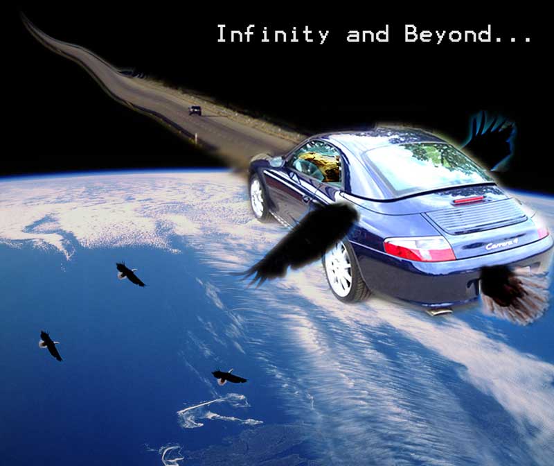
| The first car ad is directed at an audience that is
interested in "luxury." That being an audience that is more on the mature,
serious side that does not consider money an issue and high quality being
the main concern. I assume this kind of audience to be well-established
adults (or on the verge of stability) in terms of careers, perhaps in more
professional careers. What aides in conveying the image to this audience
are the image of the car, the Earth (particularly below the car), and the
words. In placing the car in an unrealistic situation (above the Earth) a
message is trying to be communicated. That message is made clear by the
text right below that car. The first phrase refers to the situation:
"Beyond Expectations." Seeing a car floating above the Earth is an
unexpected image. At the same time this is also saying that the car itself
is beyond expectations because of the fact that it is able to be in that
situation. The second phrase refers to the car specifically: "Beyond
Luxury." Because the car exceeds expectations of convention, it thus
exceeds expectations for a luxury car. In this case, I did not have any
problems with Photoshop. The second car ad is directed at a more domestic, family based audience. The signifiers used in the case are a car, a dog, and text. The text makes it obvious that the ad is geared toward family: "Approved by Every Member of the Family." The image of the dog driving the car is conveying the idea that the dog likes the car so much that it wants to drive it, and is. The connection that this makes with family is based on the association that dogs have with being an important part of families. Without knowing this piece of information it is still possible to understand the message if taking the words "Member of the Family" and applying it to the live subject-the dog. The font is also a more playful kind of type, being appropriate for concepts surrounding family. I did approach some difficulty in trying to get the car to look like if it belongs with the background, but considering that the image of a dog driving is highly unrealistic, I did not feel it would pose as a significant problem. |
|
|
|
|
 |
 |
| Ad 1: Pair the like images This ad targets businessmen and other professionals in the upper middle class to wealthy demographic, specifically ones that have a strong ego and sense of competition. The ad creates an image of the car "fit" for competition and primal urges of success. It relies on the commonly seen courier font in conjunction with the industrial light blue color used on standardized tests. From the ad's heading, the viewer assumes the position of a test-taker, because of the visual context of "Question 6." The ad invites the viewer in an interactive manner, enticing him to metaphorically "draw the line," be correct, and buy the car. It relies on the second order mythologies associated with both the images of animals and cars shown in the image. For example, the puppy dog, considered cute and harmless is tied to the minivan, an image of domesticity and humility. The moose, a large, considered to be a large ungraceful creature is linked to the truck. The test question created by this ad is meant to be obvious, ratifying the viewers sense of an intelligent self image. By assuming the guise of academic truth, it tells the viewer "you're smart, so buy this!" The key to this ad is the interactivity. The viewer creates the real advertising effect in their own mind, as the link between the expensive car and society's vision of a successful man only exists in the logical progression hinted at by the image. Ad 2: See it for yourself Due to the nature of the car's price, this ad targets the same monetary demographic as the previous, but caters to less competitive, more creative viewers. This ad relies on the semiological virtues of what is shown and what is hidden. The image of the car created by this ad is one of mystique and exclusivity, qualities highly desired by the target demographic. This ad also engages the viewer interactively in a mental exercise to complete the ad by envisioning the car. By removing the car from the sight of the viewer, he or she becomes more enticed by the fact that he or she is not "allowed" to see it. This causes more interest in the car, which is now put on a higher pedestal. This ad caters to creative types, because the mind of a creative person can create a better image of a desirable car than any picture possibly could. With mental envisioning comes feelings of interest and desire that can't be represented photographically in two dimensions. The frog signifies a "wowed" customer with its huge eyes, in shock, barely clinging to a branch. |
|
|
|
|
 |
 |
| My first ad for the Amphibimobile is, in my opinion, a
well-constructed, aesthetic advertisement. Put simply, the ad is directed
towards frogs, old and young. The forest is an appropriate scene for this
ad because it is the habitat for many frogs, and in this case, the tree
frog (I think). The overall scene shows the idea of control, having tied
up a trespasser, and implies to the audience that driving this car, you
will be in control of things around you. By having a tied-up-human,
dressed in camouflage, the ad also shows a sense of protection and
comfort, two qualities that the ad wishes to project. If you can tie up a
human with this car, you can do nearly anything. The ad gives an
invincible feel to driving this car. The fact that is says "protect your
community" clarifies the above point that it is directed slightly more
towards older frogs (young ones may not be interested in helping the
community). On the other hand, looking closely at the frogs, you will see
that some of them are wild and "teenage-like." This does make the car
appeal to younger frogs, thereby directing its message to a broad spectrum
of frogs. The fact that many frogs are driving together and working on one
single project was meant to give the "jump on the bandwagon" approach that
"everyone is doing it" and it is the "cool" thing to do. Many times,
seeing a lot of other people (or frogs) that have something will make it
appeal to the audience even more. The caption on the bottom will excite
the audience about the car, and make them feel like if they drive it, they
will be cool, look good, have control, be powerful (enough to catch a
human), and fit in with the crowd. Overall, I think this is very well
directed towards the intended audience. On the technical side of things, I felt pretty comfortable with Photoshop. I like the way I was able to take a minivan, and convert it into a mini convertible with almost no signs of tampering. It actually looks like a car that I would want! I was able to take the frogs off their leaves, and sit them in the car, intensify their colors, and add some flare to each individual frog. Even the head and arm positions were something that took a lot of time and something that I am very pleased with the turnout. I think the image of the frog in the car is, more or less, great. I am happy with the way the cars blend in to the scene, and are driving behind branches, leaves, and grass. I am also quite pleased with the way I converted a stretching woman into a safari, camouflaged, outdoorsy person. I essentially dressed her from scratch. The only technical thing that sort of stumped me was how to make the ropes more realistic. At first, they were plain white, which stood out too much, so I added some shading (on the ropes and the ground)…which I think looks better. Overall, I am very happy with this add, and think it is not only clever, but technically an aesthetically well produced. The second ad, Reddiamond, is much softer and less busy, which doesn't mean it was less technical. The ad is directed towards married, wealthier, men who should go out and buy their wives these particular cars. It is sort of a spin off of the typical jewelry ads, but that's what makes it catchy. The car being the gemstone on the ring makes the car precious (like a diamond) and beautiful. The red on the color of the car really makes it stand out and catch the audience's eye. The silhouette of the "couple" gives a sense of intimacy and romance, while strengthening the idea that this ad is directed towards couples. The fact that the car is on a piece of jewelry and named Reddiamond gives it a prestigious, expensive feel. I think the ad works as one directed to mature, upper class, romantic couples. On the technical side of this ad, it took a lot of time. Because I didn't use one of the provided backgrounds, I needed to create one from scratch on Photoshop. The ring was really hard to make because I wanted it to look real and 3D. Once I got the shape and color about right, finding the right texture was difficult. I think between the shading and the texture, I did a pretty good job, considering my limitations with the assignment, but sort of wish I could have used a photograph of a ring instead. The other technical part that I am very happy about is the lighting in the back. The lighting and shadow of the ring took a long time to perfect, and look pretty darn close to how real lighting would actually look. I am very happy with that aspect. My next issue was whether to make the background have the lighting or just completely black. I made an ad with both of these backgrounds, and both of them worked, each giving a slightly different feel to the ad. The black tended to accentuate the ring more, while the lighting gave a more romantic, real feeling to the ad…and I liked that. Another issue was whether to include the silhouettes. In the end, I decided they gave an appropriate romantic feel to it, so I kept them in. The words add an intimate element to the ad, and one that I thought fit very well. All in all, I am very pleased with the way this ad turned out, and think it would be effective out in the real world….but maybe with a bit more work on perfecting its "real-look." I enjoyed this assignment very much because it let us demonstrate creativity and also learn how to get around certain obstacles in the technical aspects of developing an advertisement. |
|
|
|
|
 |
 |
| The two advertisements I created, "Just Like Heaven" and "Tu
espíritu" are intended to appeal to upper-middle class European-Americans and wealthy Latin Americans, respectively. The "Just Like Heaven" ad focuses attention on the purity and performance of the car (in the text) and uses the "heavenly" cloud backdrop as a signifier appealing to the notion of the car as somehow virtuous. This connection between performance and virtue (and by extension a place in heaven) appeals to Protestant/capitalist sensibilities that in many ways characterize the European-American upper-middle class. Max Weber himself pointed out that the Protestant work ethic reflects the belief that material wealth in this life is a sign of virtuous performance and an afterlife in heaven. The ad capitalizes on this deep-seated association by suggesting that owning a BMW is "just like" being in heaven. The "Tu espíritu" advert, on the other hand, does not make claims towards virtue or performance, but rather towards more superficial elements such as "form" and "elegance", capitalizing on the the Latin American desire for "style". In this case "espíritu", while connoting "spirit" works with the text to signify the importance of individual style and how style is defined by material goods, such as a stylish new Beamer (in which, according to the text, even the most minimal detail has been thought of). This idea of style is supported by the building in the background, although perhaps mediocre to American eyes, the ribbon window denotes a form of Modernist architecture that, although its influence has waned in most of North America, remains popular in much of Latin America. Additionally, the bold yellow reinforces the idea of individualistic style while not surpassing the text's conservative warning that "some things shouldn't change". As is perhaps obvious, both adverts rely on culturally-specific
messages and values. Indeed the signs and language (in both senses of the
word) of each advertisement make little sense outside of the specific
cultural parameters of the target audience (demonstrating to what extent
signs are culturally constructed). It is highly likely that a
European-American viewing the "Tu espíritu" ad (even in translation) would
not glean a full understanding of the ad, and vice versa for the other ad.
Both ads essentially work in the same way, foregrounding the automobile against
a culturally-desirable backdrop (heaven and stylish architecture/property,
respectively) and using the text to limit the range interpretations
provided by the image. |
|
|
|
|
 |
 |
| The ad with the mountain is targeted at truckers and
shipping companies. As a signifier, the mountain represents a major
obstacle that could potentially be faced in the transportation process.
Luckily the vehicle in the ad can surpass even an obstacle as great as a
mountain. (Mountains are commonly employed metonymically in this way.)
This idea is reinforced by the caption, which alludes to the popular
same-titled song and leaves the audience to fill in the blank with "...
to keep me from getting to you." The dithered quality of the ad, its colors, and the geographic setting make the image appear like a vintage frontier-era poster. This should also play well with the on-the-move trucking crowd. Regarding the quality of the image, the truck is clearly not perfectly fit to the contour of the mountainside, but considering how unlikely it would be to find a truck of this size on an off-roading adventure as depicted, it doesn't hurt to leave a few small visual inconsistencies to the imagination. The ad with the runner is targeted towards motorists who drive on College Hill. Many of them are likely frustrated by the dominance of student pedestrians. The ad taps into the chronic road rage of said drivers and allows them to innocently live out the fantasy of chasing a student down. Some may have bought Hummers only to realize that they just didn't cut it. If at first you don't succeed, then the next logical purchase is an eighteen wheeler. It gives the motorist the opportunity to instill true fear in the would-be jay-walker. The truck, the student, and the road they share are all rather straightforward denotative signs. Synthesizing a realistic image was made difficult by the less than optimal relative angle between the provided truck object and the road in the background image. However, as you can see, the exaggerated angle is more than redeemed by the stumped trees on the left side of the road, which further the idea of a raging driver swerving along madly, about to exact revenge. |
|
|
|
|
 |
 |
| The intended audience of the composited image was all
Americans during the months following the events of 9/11. I used economic
status and elitism as signifieds; this is inherent in these signifiers:
the car model, the car's name brand/logo, and the words "style," "comfort"
and "luxury." I implemented the signifieds of freedom and American pride
by using a bucolic green background as a signifier. I used the signifieds
of governmental authority and the Iraqi war within these signifiers: the
soldiers in military fatigues, the passenger-soldier shouting, the raised
gun, and the words "control" and "homeland security." I hoped to use the
image of a hyper-energized man with a gun to promote my car. Although I
don't sense that this ad would be taken as seriously today as it would
have been immediately following 9/11, I feel that my ad becomes more
realistic in light of the consumerism explosion that occurred three and a
half years ago. My vector-based image is geared towards people 18-35 in the present. I used bright and simple coloring, trendy technology and sex appeal as the signifieds; my signifiers were the iPod-esque design, the young woman's silhouette, the BMW logo and the word "adventure." I wanted to play off of popular culture with these items to further my car's "hip" image as much as possible. I feel that my ad succeeds in doing this, because it calls into mind the imagery that the intended audience commonly associate with as attractive. |
|
|
|
|
 |
 |
| I approached my set of ads with the intent of focusing on
the physical aspects of the car in one, and the conceptual aspects of the
car in the other. In the first ad , I played on the physical form of the
car to market it to a more modern public, who seem to value sleekness and
aesthetic of forms as an indication of modernity. I used the images of the
stingrays, which are smoothly gliding through the water, to mimic the
fluidity of the car's form. In addition, the image as a whole is quite
minimal and almost monochromatic, and this, along with the coolness of the
blue, seemed to me to emphasize the importance of aesthetic form and
minimalism in the contemporary market. Even the word choice, and the fluid
geometry of the font emphasize this same sleek aesthetic in the image. In
terms of the semiotics within the image, the images of the car and the
rays are signifiers of the specific model of the car and the animals in
general, and the relationship between the physical forms creates the
persuasion in the ad.
In the second ad, I focused on the idea of the car as recalling the
idea of a certain era in time, marketing the car to a more sophisticated
crowd that would appreciate the classics. I felt that making the image
black and white, and choosing a kind of "film noir" In terms of the technical constraints of the project, the only difficultly I had was with the provided images; as many and as a varied a selection of images as were provided, it was very difficult to limit myself to only what was provided. Each concept I had in my head required a very specific image, which was not always available, and I had a really hard time really trying to explore the possibilities that each provided image could have rather than turning to free-hand drawing to create other "images" to use. I think ultimately however, the limit pushed me to really look at each image as a signifier. |
|
|
|
|
 |
 |
| In the first car advertisement, the intended audience is
the young adult seeking romance and escape from the 'real' world. In this
advertisement, the car appears to be driving into a picture of a paradise
scene complete with beach and lovers. In this ad, the signifier is a
picture that signifies a different world. Also, the couple is a signifier
that signifies love and being desired. The entire ad represents a concept
of escape into paradise that entices viewers from the intended audience to
want the car in order to be able to find a paradise of their own.
Therefore, in the advertisement the car becomes a signifier for the
signified concept of escape. Using a filter and color choices to make the
beach scene appear like a painting helped to portray it as a true
paradise. Also, using a composition with two contrasting backgrounds
emphasizes the differences that this car can make in the viewer/potential
buyer's life. In the second car advertisement, the intended audience is the bald eagle. In this advertisement, the car is driving out of the realms of earth and into space. In this ad, the road is a signifier that signifies unlimited travel. Also, earth is a signifier that signifies constraint and boundaries. The entire ad represents a concept of freedom and the ability to go anywhere and entices other bald eagles to want the car in order to be able to be free and to go beyond the limitations and constraints that they usually face. Therefore, the advertisement makes the car become a signifier for the signified concepts of freedom and going beyond ones boundaries. I did not have any technical constraints or problems using Photoshop to make either of these advertisements and I am very satisfied with my final products. |
|
|
|
|
 |
 |
| CarImage1.pdf This image is targeted towards a female/gay male under 40. I wanted to present a car for the person who is established yet adventurous. I had in mind a person working a 9-5 well paying job who has a boyfriend/husband and home but who feels the need to travel. This car will take them there. The background images obviously show all of the places you can travel, from a beach, to the desert, the American Highway, and anywhere on the planet (indicated by the planet earth). Inside the car, they symbols are simple. Obviously the dog would signify a home and companionship and I hope would bring a comfortable and familiar reaction. The attractive male is supposed to signify not only a partner, but he also introduces sex appeal by being shirtless. I liked how both of the images were looking straight ahead, looking at the viewer as if expecting a response. I think this image pulls together okay. I would have liked to have the car not look like it's floating in the air as much, it sticks out a little bit to me. Also, I found it a little difficult to color the black and white picture of the male. At first impression, I think the dog and the male may contrast a little too much. CarImage2.pdf I found this background image difficult to work with because of the quality. Many of the photos I stuck in there looked very strange because they were too detailed. I tried adding noise and blurring them a little… but I don't think it helped much in the end. I'm not sure if this add emphasizes the car enough, but I think if I were able to put a logo in the upper left it would be enough. |
|
|
|
|
 |
 |
| Overall, I feel like I didn’t succeed in achieving my goal
of selling the minivan, because I didn’t have a clear idea of which
audience/buyer groups I was trying to sell my product to. However, the
football player advertisement is generally aimed at middle-age
middle-class men with families, typical buyers of minivans. The minivan,
with its ability to tote kids, groceries, and other large items, has
become a cultural symbol of a stable family life in the United States.
This ad seeks to appeal to the man who resents that image of the minivan,
using the juxtaposition of the minivan with a football player in a
challenging stance. In this ad, the football player signifies a dominant
masculinity, asserting that the minivan is a type of car that not every
person can handle. The second advertisement evokes a feeling of leisure and luxury, focusing on the picturesque sunset background of a tropical island. The minivan, in this case, is being used to connote a sense of luxury and adventure; with the minivan, you can go anywhere and do anything. This ad, as well as the first one, relies upon the assumption of a cultural “family” symbolism of the minivan, so that it can pick apart that image and rebuild it as an emblem of leisure. Part of the reason that I didn’t completely succeed in this assignment was my technical weaknesses. I’ve worked with Photoshop before and attended the PASS class on Photoshop, but the PASS class went over aspects that I already knew how to use in Photoshop. I couldn’t change the shadows or highlights like I desired in this assignment, which meant the final product looked less finished and cohesive than it should have. I also, however, did not exactly know what my visions for the advertisements were to begin with. |
|
|
|
|
 |
 |
| Image 1 This ad aims to sell Lamborgini to people, who are lovers of high speed and wild experiences. It's addressed to adventurers, who want to drive not just a car, but the fastest car in the world. Here, the car is a sign of speed and excitement. There are four signifiers - a cheetah, a runner, the Earth and a text. The cheetah signifies the fastest animal in the world. The signified is shifted from the cheetah to the product to suggest that Lamborgini is the fastest car in the world. The runner stands to represent the runner who has achieved highest world record and the signified is again transferred to the car. The image of the Earth is a background and a signifier as well. It signifies the fact that Lamborgini is not just a fast car - it's the fastest car in the world. It also suggests the aspiration to be the best and the car is a way to achieve it. The fact that the cheetah and the man are behind the car implies that driving it will make you even faster than the fastest. The text consists of: the brand of the car, which is written in big letters and aims to be seen first; three dots which provoke people to complete the slogan by themselves: "Lamborgini, the fastest car in the world."; and a slogan written with small letters, which makes the viewer look at the ad even more carefully to read what's written below the brand. Thus, the ad attempts through its composition and the shifting of signifiers to make people buy the car and I think it may work.I have some difficulties working with Photoshop and I think that the image itself can be formed better.
In this ad Lamborgini signifies freedom, power and status. There are five signifiers - a woman, a man, a mountain, an eagle and a text. The woman at the front is a signifier of a successful, independent young woman. The signified is shifted from the woman to the car to suggest that Lamborgini is a sign of power and independence. It's a car for strong women. The man in a suit behind the woman is looking at her, which implies that he is impressed by the power that the woman expresses. The man is also a sign of the successful, independent businessman, which is transferred to the car. The eagle in the ad represents the "raw" nature and is a signifier of the natural freedom and power. It suggests the aspiration of people for high achievements and the desire to dream and be free and wild. The signified, this time, is shifted from the eagle to the car and the woman and the man, as well. The background is a mountain, in particular a peak, which symbolizes human aspiration to be on the top. The text suggests that Lamborgini will help you get there. All of the signifiers are in a similar yellowish color which aims to connect these signs and affect the transfer of their signifieds. I think the ad works. |
|
|
|
|
 |
 |
| Stealth This ad was designed for anyone wanting to ship or smuggle large items over land without being noticed. I wanted to use the common idea of night vision goggles to spot things even in the dark. In this case the ghostly image of the bat, an animal that moves silently is supposed to be associated with the truck. The image of the bat also protects the truck as it moves in front of the viewer with the night vision goggles. In this case, the truck, like the bat is undetected. The text adds another layer of emphasis by adding the word 'Stealth' to signify how the truck will go anywhere unobserved. I think this advertisement works pretty well. It was a challenge to visually depict something in an advertisement that hinges on its ability to go unnoticed. Cheetah |
|
|
|
|
 |
 |
| For the “vacation” image: Target audience: commuters. The big signifier here is the tropical background, though I tried to point up the idea by pasting and blending a road from one of the other environments into the beach, and erasing bits of the car and road so the foreground bushes of the background were in front of them, so they looked like they were really there and not stuck on. It’s a little thing, but it really improves how connected they appear to each other, and thus the link between the signifieds. The idea is to give the car the very obvious signified of the tropical beach (i.e. “somewhere you want to be”); also the road signifier literally blends right into the beach signifier to reinforce the “commute=vacation” of the text. The big technical constraint was that the background was a really “big” setting, and so the car had to be very small to fit into it, which is bad, and that I only had one car option that was pointing the right direction (fortunately it was a nice sleek car) – it took me a while to find a car and background that worked for the concept at all. So I put the car name really big to help clarify what was being sold, and picked (and then tweaked) the font to match the logo on the car. My other technical issue was finding a font for the tagline that looked relaxed (=vaction; needed to look like handwriting to imply “not at your desk typing”) but still fairly serious (=appeal to businessmen; needed to not be something really bizarre looking) - that’s probably not the ideal choice of font, but it’s not awful and is the best I had. It would probably work better if I could have made the car bigger, but that would have required a better-fitting background, and of course the reflections in the car are wrong – which I decided was not worth bothering with, as it’s somewhere between a pain and impossible to fix - but the concept is pretty strong. A tropical island beach is probably the best signifier available for “vacation; where you want to be”, even outside the assignment image set.
For the “confusion” image: In the interest of full disclosure, I use a pen tablet, which was an enormous help in turning the car red and tweaking the text in the vacation image, so they took me maybe 30-45 minutes each even though I fussed with things a lot. It probably would have been a lot harder and slower with a mouse. |
|
|
|
|
 |
 |
| When I was in 9th grade, I fell in love with a little beat
up hyundai in the school parking lot that was for sale for $700, the
sevenhundreddollerhyundai was my name for it. To me, it was so cool, but
from what was inside, I could tell that it probably belonged to some old
lady in the office. In that spirit, I wanted to try to market this old car
to both a younger and an older audience, to demonstrate the strange
phenomenon of the uncool becoming trendy among the young, or more
precisely, that certain group of kids who willingly reject the mainstream,
and are sometimes attracted to what isn't necessarily attractive. For the first ad, I used a serene landscape, light colors, and a simple, clear message to signify comfort and dependability to an older audience that simply wants a quality automobile, without any tassel and fluff. Likewise, the ad is not overly artsy, and I didn't aim to impress anyone with it. On the other hand, for the second ad, I placed a curving desert road as the background, wrote out the words in bold orange gold, and set the car at an unusual and precarious angle to suggest excitement and fun. I also signified these ideas explicitly by actually writing them out in the background. For both ads, I used light, pleasant color schemes, strong lettering, and a European sounding car brand to signify sophistication and levity, but also strength. Overall, I am happy with the message, but find the ads a little unoriginal and unpleasing to the eye. For one, I learned that it is really hard to be original without being over the top, especially when aiming the ad at a more traditional audience. My photoshop shabby skills didn't help either, as I had lots of trouble with coloring, lettering, and separating the car from the background. Nonetheless, I feel like my ideas really did come to fruition, at least enough to remind me of the sevenhundreddollerhyundai and the implications behind it. |
|
|
|
|
 |
 |
| Car 1: This ad was clearly inspired by the iPod advertisement campaign. iPod's (and by extention, this ad's) audience is aimed toward the 'hipper' crowd of young people, or young people who at least want to be hip. This is made possible by a bold color background and stark black-and-white forms on top: there are no muted pastels that one finds in many commercials/ads for an older audience. The strong colors to me suggest excitement, boldness, and fun. Colors, in this case, are the most important signifiers. As well, the silhouette pattern of the ad is quite ingenious: instead of seeing an actor's face or body, a viewer sees a black outline that is not immediately associated with any facial features -- this makes it easy for the viewer to imagine their own face in that position. Also, the product in question that is being advertised is the most illuminated shape in the ad: a white car and white keychain. I not only included the keychain around the woman's neck to make a commentary on the earphone motif from an iPod, but with the keychain, the woman has a better sense of "owning" the car with her keys, moreso than if she was standing next to, and independently of, the car. As for technical constraints... not very. The effectiveness of the ad is attributed to its bold simplicity, so there weren't many details to kink out. I believe that this is an effective ad. I can't tell the effect it would have if the iPod campaign had never existed, but I believe that it would still cater to the same age/cultural demographic. Car 2: The signifiers in this ad are firstly the well-dressed man. He's very handsome, he's smiling, he's dressed well, he approves of this car. He is positioned behind the car and not on the driver's side; his positioning therefore can be interpreted as him offering it, a gift-gesture of sorts. As well, the sleek black floor reflects the car and man, definitely an unnecessarily luxurious environment. The reflection is an element that is used in all of the Zales diamond ads I came across: the object's brilliance is emphasized in this manner. The sparsity of this ad, as with the one above, I think makes it an effective one. A no-nonsense, sleek, sophisticated design caters to the image of the man giving the gift (no-nonsense, sleek, sophisticated) and that carries through to the audience. Except for the obvious "car" references in the text, all the slogans were taken almost verbatim from Zales ads. Borderline cheesy, yes, but it gets the message across. Given such a plain car, I believe I succeed in portraying it as a priceless diamond, with alterations in environment and transposition of the car with the image of the well-to-do man. Challenges come across in this ad: I found it difficult to get rid of the reflections of the trees and sky on the car windows and surfaces. I did my best to overcome that but have minimal Photoshop experience, so the car may seem blurry. (Or maybe not!) Also I didn't have many stats on the car or fitting slogans to fill up blank space. |
|
|
|
|
 |
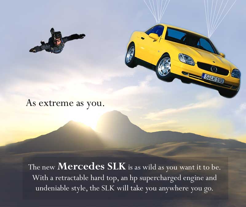 |
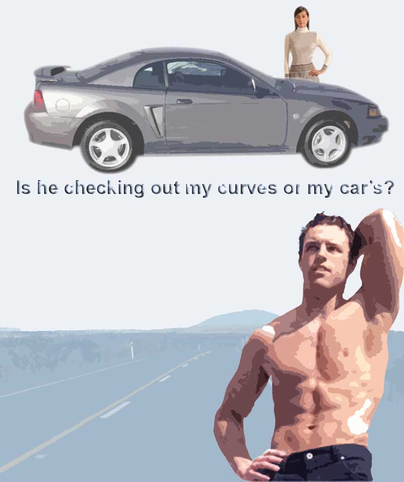
| #1: The Girly Ad: "Some things are better than your
wildest dreams". This ad was a bit of a gamble since I pulled out my paint-by-mouse skills instead of using one of the backgrounds provided. As I was looking at the house background, I was thinking how typical those ads are that show the nice house, the handsome smiling husband, perhaps a cute kid or dog-all the things that suggest happiness, stability and longevity. More than that, though, they are the things that many women were taught to want at a very young age. And so I took that idea, and tried to capitalize on the image that so many of us had as young girls-and thought it might react well with women who were in the process of building a family or realizing dreams that they may or may not have had when they were young. Perhaps if a little girl were the audience, the ad could make a long-standing impression that a Mercedes sports car is the perfect addition to her dream house. The target group is 20-40 year old women who grew up wanting 2.5 children and a white picket fence. So there are several layers of signifiers and signifieds: the poorly drawn image signifies a childhood drawing which signifies your dreams, the house signifies stability and longevity, the white picket fence signifies the suburban American dream, the car signifies wealth and status, and the man signifies stability, love, completion and happiness. I honestly don't know if it works. I think it comes off a little bit silly, which I partially intended, but I don't know if it really says anything about the product or makes you want to buy it. I think I prefer it without the man-I think he detracts actually. I kept him in to try to stay truer to the assignment. And no, I didn't have any technical constraints. #2: The Danger Guy Ad: "As extreme as you". Even though you obviously wouldn't take the car sky diving I wanted the ad to make the car appeal to one's adventurous side. It can be a convertible for an adrenaline-pumping speed session, or have the top on for a dusty road or your average drop from 15,000 feet. The direct target audience is the 16-30 year old extreme athlete male, but I think it also touches on a wider population such as adventurous females and older males. My main frustration with this advertisement is that I think that it is boring and relatively typical. I feel like if the skydiver and a guy in the car had green cans in their hands it would be a mountain dew ad. Another shortcoming is that I don't even think this car has 4 wheel drive so it may even be misleading. Technically, my biggest problem was trying to make the car appear to have the same perspective as the skydiver. Because of the shape and perspective of the car, it was very hard to skew it appropriately. |
|
|
|
|
 |
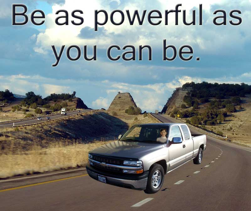 |
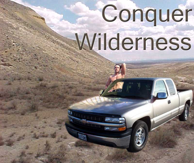
| "Conquer Wilderness." For this ad I chose to market to a demographic of young males, eager to prove themselves to the world. I chose images that had signifieds of power. The strength represented by the model, the vastness signified by the desert. The slogan "Conquer wilderness" ties the signifieds together and implies that with this Ford you will have the strength to conquer anything. This is a rather typical kind of truck market. It closely resembles the "truck on top of mountain" type of ad that is predominant in our culture. In that sense it "works" the truck almost alone has begun to carry these signifieds by the repeated use of these signifieds in ads and I used that to my advantage on my second Ad. "Be as powerful as you can be." I chose a demographic often targeted but not by trucks, that of the young business woman. The truck itself has begun to carry the signifieds of power and strength. And combined with the apparel of the woman I wanted to create an image that said "you can make it in the world if you have the strength of a Ford". The open road carries the signifieds of future endeavors and possibility, often clichéd by the phrase "the road ahead". I wanted to show that the woman had all the strength generally associated with the truck and could because of it defeat the road ahead. It works relatively well. I think that the background should have been a company's parking lot, and I wanted to have an image of a woman with a briefcase. However for the images provided I think I manage to transfer the dreams of the woman and the power of the car together and make them intertwined to the point that the car is necessary if she wants to fulfill her dreams, I had relatively little difficulty with using Photoshop. The most constraining factor was the selection of images to use. I also don't feel I was very creative in this assignment staying within well defined and over targeted demographics. |
|
|
|
|
 |
 |
| Carry Your Offspring with Care The target audience, environmentally-compassionate middle-aged parents, may react with an "aww," but what is really going on here? The truck gains its values from three other signifiers compose the ad: foxes, Earth, and text. Each pairing of signifiers alters the signified of both images. For example, the foxes and Earth signifiers together indicate more environmental concerns and nature (instead of other possible signifieds, hygiene or globalization). Placement of the truck at the text's conclusion implies that the truck will carry your children with care. And what is the signified for 'care'? In relationship to Earth, 'care' means environmentally-conscious; for trucks that equates to better gas milage (as one viewer immediately concluded). Additionally, 'care' in the context of the mother fox poised over her vulnerable kit, transfers the signified of physical safety to the truck. Finally, because it is natural (simple, best) for a mother fox to carry her litter, the implication is that it is natural for a mother to drive her children in a truck (instead of a minivan). I'm satisfied with this ad's simplicity. After five drafts of this
project, I realized that with fewer signifiers, I could create more
extreme transfers of signifieds. I had no technical difficulties. In the narrative, visual surroundings dramatically affect an image's perceived signified. The thai girl, represented at left as something pleasantly foreign (her reserved expression echoing a documentary) is at right imbued with far more cuteness because of her size and bright colors in contrast to the truck (here her deadpan face creates a deadpan humor). Any narrative we might infer from these signifiers is absurd: if the girl is bored, this truck transports her to a new location. Four pairings/paradoxes are especially irreverent: 1. the signifier 'bored?' with the signifier of the girl -- by mere proximity, we assume the referent is bored (actually, I think the buyer is more likely hedonistically bored); 2. girl and car (Why would she value it? Where would she buy it? How would she pay?); 3. car and location (Can you really go anywhere in a truck--to an island or another continent?); 4. girl and location (Because the same image represents the girl at left and right, we suppose her action/feeling doesn’t change with location -- i.e. she's still bored). But if the girl is still bored, then why is "go anywhere" a cure for boredom? After a little thought, the viewer might conclude the truck’s value is not a product, but a process! Driving is a better cure for boredom than a tropical island. I think the ad works, but is a little dense. Because traditional images are currently being exploited in new advertising styles (as with the gnome), the code for understanding the signifieds is changing. It takes more time for a viewer to sort through the cultural code and figure out the girl's signified. When I showed it to other students, they appreciated it's shock-humor, but they weren’t sure what the larger joke was. I had no technical difficulties. |
|
 |
 |
|
My first ad depicts the ideal warm-climate home with the ideal sports car parked in the driveway. In the foreground stands a handsome laughing man in a business suit. The subject of the picture, though is the woman, staring confidently at the viewer with her hand on her hip. She is attractive, fit, and strong. She represents the ideal independent woman owning her own car and house, and possessing the ideal boyfriend, an attractive, easygoing yet responsible man. The slogan “every woman needs one…” is intended to be ambiguous, emphasizing none of the elements pictured behind the woman. It supports the thought that the car, the house and the boyfriend are all equally important components of the independent woman’s life. Each are equally essential. No independent woman is complete without one, therefore no independent woman is complete without the car. Most of my problems arose from the limited selection of images. My ideal image for the woman would have been the same model, only in a business suit. I would have liked the house to be more urban. I think the business suit and the urban home fit more into the image I was trying to portray. All in all, I think this ad is effective, but not ideal. My second ad is much more simple. It is composed of a red minivan with a sexy car model suggestively stroking the hood of the car. The woman not only represents sex and youth, which in themselves when associated with the product elevate it. When the viewer looks at the picture, he is given to the illusion that the model is smiling suggestively at him. This element of desire is integral in this ad, because it is confronting the stereotypes associated with the minivan. Minivan drivers are stereotypically middle-aged men and women. This ad confronts that stereotype, and tries to overcome it. I don’t think that this ad is effective. While it is visually very attractive and pretty well-done, I think that it looks ironic. I think that instead of actually working to overturn stereotypes of minivan drivers, it only highlights those stereotypes because its use of sexuality is so over-the-top. I think it would have been more convincing if it were more subtle. |
|
 |
 |
|
The Getaway car 01 Target: male Content: The idea started from the conversations that I had with many of my male friends, who commonly said that they are mostly stressed about all the responsibilities that they have to burden, such as marriage, job, family, money etc. While all the male figures are running away from the world by foot, the Getaway car suggests the fastest and the easiest way to escape all the Œresponsibility.¹ The car goes to another direction from the running men, which suggests there would be more private time for the driver, even from the male peers if the driver wants to. The tacky design and strong colors emphasize the humorous side. The composition of the ad intends to move the viewers¹ eyes diagonally, top to bottom towards ³The Getaway car,² and the suggested movement of the figures implies a sense of energy. There could be more tweaking on the texts to make the word responsibility¹ to rise from the earth, and the Getaway car¹ to stand out. 02 Target: female Content: I wanted to use the same car with same idea, but aim towards the female customers. I chose to poke the Œromantic¹ side for the female, since romance is women¹s all-time favorite subject to fantasize. The word Œhe¹ in the copy Œhe¹s waiting for you¹ remains ambiguous as to which Œhe¹ that the ad describes: be it the car itself, or the perfect man who is waiting for Œher (the customer)¹ inside the car, the romantic atmosphere will catch the viewers¹ eyes. The background image of the beach sunset is the most important: it not only creates the mood, but also the black shadow of the leaves blends well with the black text Œhe¹s waiting for you,¹ while the tree trunk on the right side leads the eye towards the car that is parked underneath. The font and the color of the text was carefully chosen to echo with the background and create the quite and romantic mood. |
|
 |
 |
|
First ad: This advertisement is aimed at Christians. The image of a car "driving" on water recalls the passage in Matthew 14 in which Jesus walks on water -this is one of the better-known stories surrounding Jesus and would immediately be recognized by a practicing Christian (as well as many non-Christians). The images in this ad work to reference this story not by their individual signified/signifier relations, but instead through the relation between the two objects/signifiers, namely the automobile and the ocean. Naturally, each image carries certain denotative and connotative meanings (ocean as peaceful, immense, for instance, while the car is conservative and dour), but the text clearly "anchors" the ad in the code of Christian belief, by use of the word "Savior" to signify Jesus Christ, as well as the biblical-looking font. Using the first person pronoun "our" creates an illusion of shared view between the creator and the reader of the advertisement - a particularly effective method of appellation. The slogan, together with the image, work to make a metaphor which links the ocean in the ad with the Sea of Galilee and the car - or, to be precise, the driver of the car - with Jesus Christ. The advertisement hopes that the reader will want to be part of this linkage of meaning, which is equivalent to Barthes' system of mythologies: the reader (hopefully) identifies with that which is signified by Jesus Christ, more so than with the man (as a signifier) himself. Second ad: This advertisement is aimed at gay couples seeking domestic bliss and wealth, as denoted by the large house in the background and the conservative, expensive car in the foreground. (I hope the car is expensive - I'm really bad at "reading" cars.) The connotation of the men resting on top of each other just as they rest on top of the car indicates that the car is a sturdy and supportive part of the relationship. The black and white coloring adds to the conservative tone. The difficulties with this advertisement is that the image of the two men carries a great many connotations,aside from "gay couple" - the handlebar mustache and bare muscles connote a rather more sleazy and sexualized idea of male homosexuality, one that is not readily compatible with 'domestic bliss' as signified by house and car (the signifiers). This is where I suspect this ad would fail, since the ad is trying to sell the signifieds "domesticity" and "supportive relationship," transferred onto the car, and not sex and sultry gazes. I tried to work with this problem by including more signifiers of "gay pride", like the slogan that references a disco hit. The only color in the image is the pink, defiantly capital, ARE, of the text, stating that, "No matter what anyone else may think about our mustaches and muscles, we are a loving, caring pairing of human beings." In this context, the "domesticity" signified is a contested and controversial one; the text tries to acknowledge and resolve this controversy. |
|
 |
 |
|
Ad. 1 “For the Goth on the Go” My add is meant to lure all Goths, Gamers, Vamps, Ren-faire Pirates, and Poets-anyone with a haunted romantic soul. It also caters to those with a quirky unique “dark” humor. The mixture of gothic/bright colors is perfect for Uber-Goths everywhere. The dark dramatic, looming shadows and strong contrasts illustrate the seductive drama of this car. It is erotic in its gloom and mystery! The woman’s is a signifier. Her body language is representative of seduction and attitude. Her eyes smolder from under the dark shadowed contours of her face. Although, she is the only real and “solid” object in the ad, she is still subsumed by the transparent car. Despite that the car is a haunted object in itself, it has the power to overcome the strength of her body posture. This confusion within the optical play on the cars transparency problematizes it. The problems of this image and the cars “glowing” color place it at the center of the ad. Although the woman is powerfully exerting her identity the car is still central. The message is “hey, if you have this car you can be even more mysterious and overpowering than this seductive women. There is no longer need to feel intimidated by her rapt smoldering sexuality!” Or perhaps, “you too can be as achingly mysterious as the anonymous “Lenore” in this ad. Her mesh clothing is a further signifier for the dark power of sexuality. The “raven” perched on her shoulder and the transparent bats conjure up powers of the dark feral forces of nature. These dark powers are signified by the evocative power of these animals as signifiers. Hence, if you own this car-you too can control the elements! This ad. would probably be more effective if a car was chosen more conductive to the gothic style. The style of the car, as it stands now is contrary to the whole gothic demeanor. Which, only serves to heighten the purpose of this add as a joke. Ultimately the add in this format is lighthearted and rather like a large inside joke. The question here, is could this humor sell? As it stands now all elements of this ad. combine to create a kind of playful pun off subculture. It is very self-referential. No Goth that takes themselves too seriously would every buy this car! I had slight difficulties in photoshop This is the first time I used photoshop. I would have liked it be less “warm” in tone and less reminiscent of a “Barbie Goth.” It took me a while to figure everything out. I think I would have liked to play with the idea of mist and transparency more. I was originally going for a cross between “Sleepy Hollow” and “The Cure.” There are many things I could have done better had I had the skill. Ad. 2 Bada Bing/Bada Boom The particular demographic this ad. caters to is the suave sophisticated mobster. Or those who are intrigued with the dangerous romantic lifestyle of Tony Soprano. In practicality it functions like a mad magazine cartoon. It is meant to be a critique rather than an ad. Therefore it primarily caters to those with a dark sophisticated humor. The impression that the car is able to traverse rough terrain leads to a sense of durability. Despite being a luxury car, it is able to go anywhere, on any occasion. The man in a suit is one signifier present. Connotations associated with him would be those of luxury and power. A step further would be associating him with the romance/drama of the mafia lifestyle. This guy is obviously in control of the situation. His expression, nonchalant demeanor, over his crime readily points to the causal “hey no worries, I’m in control” attitude that the driver of such a luxury vehicle would possess. He is in control; he is behind the wheel. The crime itself overshadows the car indicating that this is not a “real” ad. meant to sell, but rather a social critique of the cut-throat competitive business of “selling” itself. Being from a town lined by car dealerships, competition between car agencies is readily apparent to me. New car dealerships are always taking the place of older ones. It is an incredibly cutthroat world. In its own way, it echoes a type of mafia mentality. This ad. is addressing that factor, and also highlighting the ridiculousness of car ads. The shock the audience feels makes them momentarily aware of the absurd “dog eats dog” mentality of the business world. Would it work? This add is playful. The shocking violence of the ad. is purposely over the top. It is not meant to be taken seriously, it is readily apparent that the smiling dead man is fake. It’s not meant to sell anything really, but instead to be a social critique of the cutthroat world of advertising. |
|
 |
 |
|
My "Batman" ad had a target audience of manly men who think that the car
they drive should reflect their masculinity, and like cars that go fast and look showy - the class sports car group. (NOTE: The car I choose looks like it belongs in that car from my ad, but of course, it is a random low-end Dodge Neon). Signifiers: All of the references to it being a space-flying Batmobile. Signified: that someone who owns this car will become as awesome as Batman, and gain the abilities to skydive, fight off criminals, act suave with the ladies, and more. I think it turned out pretty effectively. My "Transvestite" ad had a target audience of the LGBTQ members. Just like with any "official sponsorship" it targets anyone who might attend a Gay Pride Parade. Signifiers: The tunnel vision effect and the "sexy" man. Signified: Not only is this car (again, a low-end Dodge Neon) a sexy car, you will become a more attractive person because you drive it. I don't think the signifiers are themselves as effective in this ad as in the Batman ad, but the overall effect is at least as effective because of the punch-line and the "official sponsorship" status. |
|